Back to work

PXP

What’s out of focus deserves to be seen too.

Visual identity for a series of alternative urban music events in Mallorca that brings together culture, community and social commitment.

Project
PXP
Context
Final degree project · Concept project
My role
Research, concept development and visual identity design
Discipline
Branding · Visual identity
Course
2024 – 2025

The context

An alternative to the mainstream.

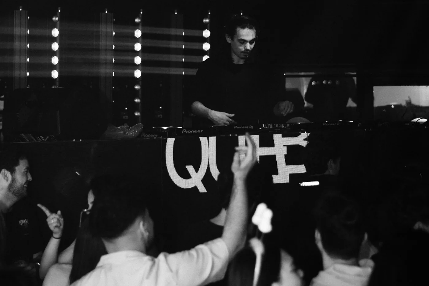
Black and white photo of a DJ in the booth with the crowd dancing in front

PXP was born from a gap in Mallorca’s cultural scene: creating a space for alternative urban music, beyond the usual commercial circuits.

The proposal is a series of travelling events that combine music, cultural identity and solidarity, donating part of their profits to environmental initiatives and natural disaster relief.

The challenge

Bringing into view what falls out of focus.

The challenge was to build an identity that could connect with the urban scene without falling back on its most predictable visual codes.

The brand had to convey energy and personality, but also represent its social side. It wasn’t just about designing the look of a party, but about giving shape to a proposal with its own message.

My contribution

Explore before defining.

The project began with research into the urban music scene, nightlife in Mallorca and the identities of alternative events.

From there I developed three visual directions, inspired by digital aesthetics, graffiti and blur. I chose the last one because it could connect the music world with PXP’s social purpose through a single idea.

The concept

Out of focus. Into the conversation.

Blur becomes the backbone of the identity. In urban music, it stands for the voices, artists and realities that are often left out of the most visible spaces.

On the social side, it refers to the causes that stop getting attention once they drop out of the news. One visual device connects both worlds: what we don’t always see, but deserves our attention.

Black and white close-up of a young man in a beanie looking at the camera
Move your cursor over the image to bring it into focus.

The visual system

From name to system.

01 | Logo

PXP: the people, by the people.

The name (Spanish for “the people, by the people”) sums up the festival’s idea: a scene that sustains itself. The logo is built in lowercase Newake on a 45° grid: the p’s are rounded on the outside and straight on the inside, and the x is enlarged to match their weight.

02 | The x

The x as a graphic device.

The x stands for “por” (“by”) in the name. It works as a symbol when space is tight and as a censoring device: it replaces letters, as in “sxld out”, and crosses out or highlights words.

03 | Colour

Orange to make a stand, black to hold it together.

Orange and black are the main colours, supported by grey, ivory and off-white. The colours are defined in RGB, CMYK and HEX so they stay the same on screen and in print.

OrangeHEX #FF3722
RGB 255 · 55 · 34
CMYK 0 · 86 · 83 · 0
BlackHEX #22211F
RGB 34 · 33 · 31
CMYK 73 · 64 · 62 · 79
GreyHEX #717365
RGB 113 · 115 · 101
IvoryHEX #D9D9CF
RGB 217 · 217 · 207
Off-whiteHEX #F5F4F4
RGB 245 · 244 · 244

04 | Typography

Newake for the brand, Proxima Nova for everything else.

A typeface with character for the brand and a versatile one for communicating. Newake brings the logo’s bold, rounded shapes; Proxima Nova, with eight weights, handles everything from a poster headline to the small print on a ticket.

Newake

Designer
Indieground
Use
Logo
Style
Geometric sans serif, bold
Newake: ABCDEF abcd1234 Newake alphabet in uppercase, lowercase and numerals

Proxima Nova

Designer
Mark Simonson
Use
Headlines and body text
Weights
Thin to Black
Proxima Nova: ABCDEF abcd1234 Proxima Nova alphabet in uppercase, lowercase, numerals and symbols
Proxima Nova weights: Thin, Light, Regular, Medium, Semibold, Bold, Extrabold and Black

Design decisions

An identity built with intention.

  1. 01 | An X with a double meaning

    The X is PXP’s most recognisable element. Designed on a 45° grid, it can turn into a plus sign (+), linking the identity to the idea of making a positive impact.

  2. 02 | Blur as a visual language

    Blur is applied to type, photography and graphic elements to create depth and movement. More than an aesthetic effect, it’s a way of carrying the brand’s core concept into its applications.

  3. 03 | A flexible graphic system

    The wordmark, gradients and graphic devices make it possible to build compositions with character, while keeping the identity recognisable across formats and media.

The result

A brand made to be seen.

The result is a conceptual visual identity that combines a contemporary aesthetic with a social message.

PXP uses design to give personality to an alternative music proposal and turn its values into a recognisable, expressive and adaptable graphic language.

Blurred PXP story with the logo: the first teaser for the event
PXP story with the blurred poster
PXP story with the sharp poster: 29.09, La Tremenda, DJ sets by Sneaky WH, Koboss Beats and Dani BM
PXP Instagram post with the poster and a blurred “sxld out” message

Stories

The blurred version announces the event; the sharp one reveals it.

PXP roll-up banner
PXP poster on a totem display
Black tote bag with a blurred “sxld out”
View brand guidelines (PDF, opens in a new tab)

What I take away

This project allowed me to develop an identity from its strategic approach through to its final applications.

Above all, I learned the importance of exploring different solutions before choosing a visual direction, and of making sure every graphic decision responds to an idea, not just an aesthetic preference.

Shall we talk?

Email me
Find out more
Privacy policySitemap