Cabot Hotels
A fresh look at dining.
A dining page for Cabot Hotels, designed to bring together the food and drink offer of all its properties in a single digital space.
The context
An existing website, a new page.
Cabot Hotels already had a custom-designed website, where each hotel has its own dining page.
What was missing was a general page bringing together the whole chain’s offer, so that all its restaurants could be discovered in one place.
The challenge
More dynamism. The same identity.
The client felt the hotels’ dining pages were too flat, with image and text blocks simply following one after another.
For the general page they wanted something more dynamic, without breaking the website’s visual language or redesigning it.

My contribution
From feedback to visual solution.
At Clicktotravel, I designed the new general dining page for Cabot Hotels.
My work focused on this page and on two components created specifically for it. The rest of the website, its visual identity and its structure were already in place.
Custom components
Two ways to present dining.

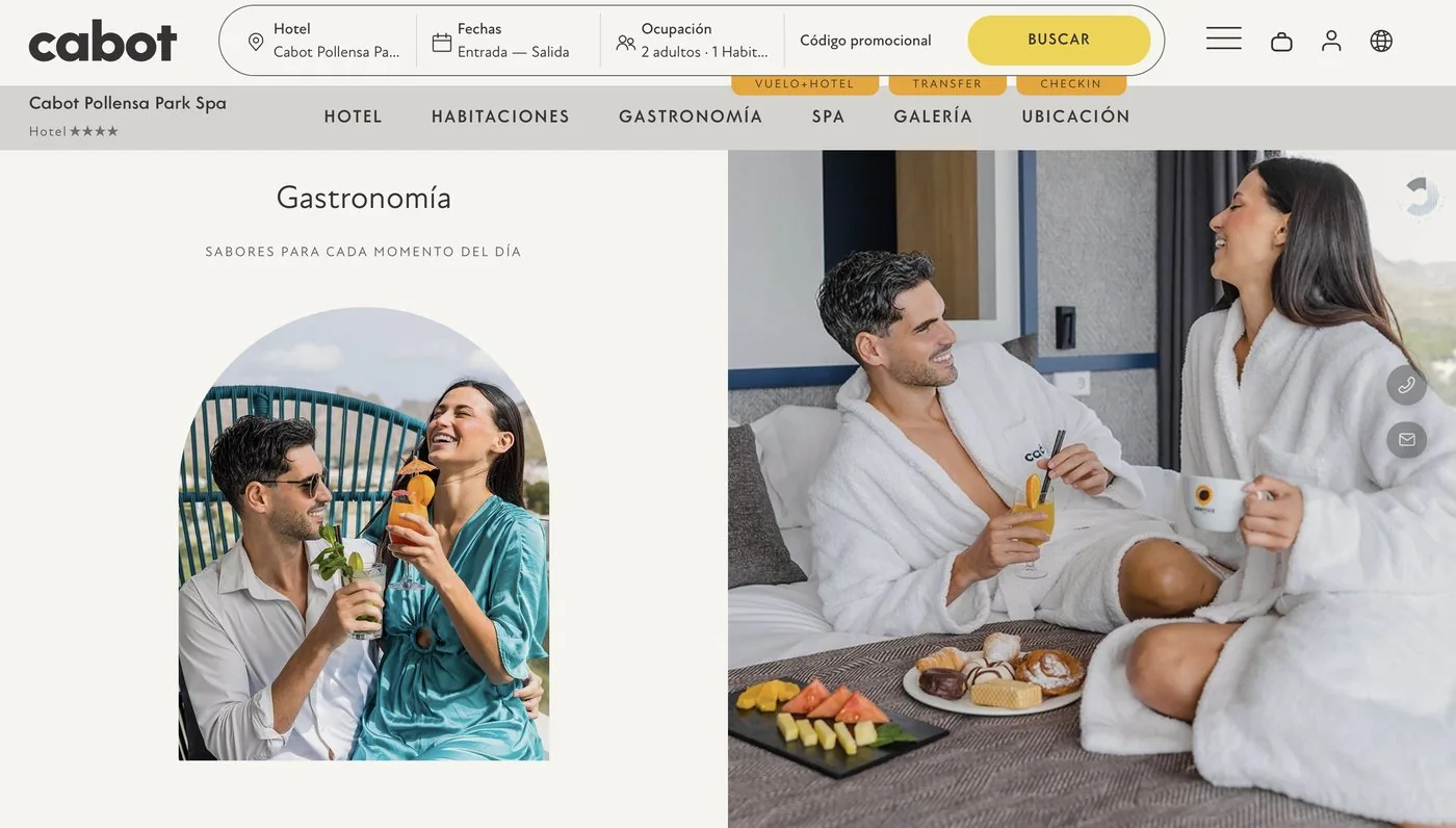
An entrance connected to the brand.
It opens the page with the chain’s main dining options. The arch-shaped photos reuse a device already found on the website and connect the new page with the rest.

A layout that invites you to explore.
A carousel with a featured dish in the centre and others partly visible on either side. It hints that there’s more to see and invites you to scroll through.
Design decisions
Finding the balance.
01 | Visual integration
The new elements build on the website’s look and feel, so the page reads as part of Cabot Hotels rather than an add-on.
02 | Rhythm and contrast
Alternating two different ways of showing content avoids the repetitive, identical blocks the client saw on the hotel pages.
03 | Photography takes centre stage
Giving more room to images of the restaurants and dishes makes the offer clear at a glance, with less text.
The result
A new dining experience.
A single page that brings together the dining offer of the whole chain, with a more varied presentation than the individual hotel pages.


What I take away
This project taught me to tackle a design need without rethinking everything that already works. Starting from an existing website, listening to the client’s feedback and working within its limits helped me find concrete solutions while keeping the brand’s character.